Gnome Data Mine: GDM Plot
GDM Plot
GDM Plot is a Gnome GUI for generating binned plots of data distributions. The GUI was constructed using Glade and the code is written in Python.
Installation
GDM Plot is part of the Gnome Data Mine toolkit developed for GNU/Linux. It can be downloaded from here and extracted from the archive using tar zxvf gdmplot.tar.gz. The program can be run from the extracted directory with ./gdmplot.py. Try it out with the sample data.
The program can be installed with make install which installs into /usr/local by default. To install elsewhere use make PREFIX=/usr install, for example.
Examples
The main window is:

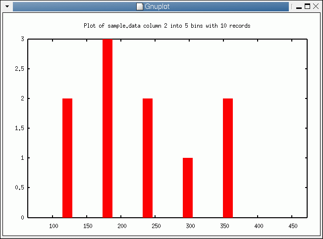
Browse to the sample data which is:
2 157.667 881.000 73.236Then select Column 2 and 5 bins. The data will be split into 5 equidistant bins and the frequency of each bin is plotted:
1 122.167 361.000 49.337
1 198.429 438.000 151.421
3 191.778 121.000 229.926
15 267.600 489.000 185.258
15 400.667 625.000 123.446
3 414.250 170.000 100.251
3 246.286 105.000 66.244
14 356.500 1114.000 1830.000
4 191.333 1253.000 52.690
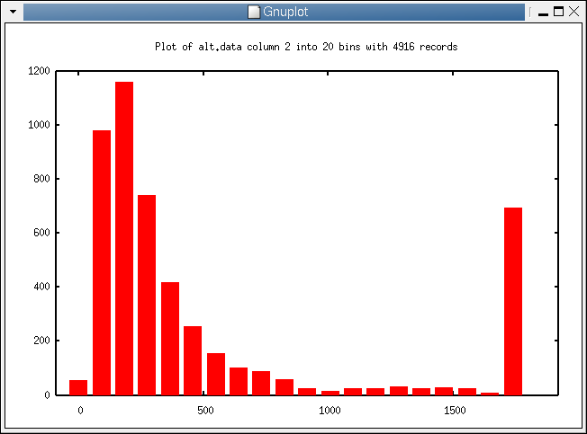
A slightly more intersting plot is:
Subsets
A very simple subset mechanism is implemented to select records having a particular value for a specific column. For example, you can specify that you are only interested in records having column 1 equal to 5. This is useful after having performed a clustering and you wish to explore different clusters. The subset expression in this case would be:
C1=5
Copyright © 2006 Graham.Williams@togaware.com
Last modified: Wed Jan 4 10:54:57 EST 2006