
Desktop Survival Guide
by Graham Williams
|
|
DATA MINING
Desktop Survival Guide by Graham Williams |
|
|||
|


|
Plot means and error bars by a group factor.
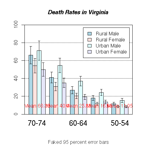
# Suggested by Sander Oom
library("gplots")
pdf("graphics/rplot-bar-means.pdf")
  hh <- t(VADeaths)[, 5:1]
  mybarcol <- "gray20"
  ci.l <- hh * 0.85
  ci.u <- hh * 1.15
  mp <- barplot2(hh, beside = TRUE,
                 col = c("lightblue", "mistyrose",
                   "lightcyan", "lavender"),
                 legend = colnames(VADeaths), ylim = c(0, 100),
                 main = "Death Rates in Virginia", font.main = 4,
                 sub = "Faked 95 percent error bars", col.sub = mybarcol,
                 cex.names = 1.5, plot.ci = TRUE, ci.l = ci.l, ci.u = ci.u,
                 plot.grid = TRUE)
  mtext(side = 1, at = colMeans(mp), line = -2,
        text = paste("Mean", formatC(colMeans(hh))), col = "red")
  box()
dev.off()
|