Desktop Survival Guide
by Graham Williams
|
|
DATA MINING
Desktop Survival Guide by Graham Williams |
|
|||
|


|
A barplot displays data as bars, each bar being proportional to the data being plotted. In R a barplot is built using the barplot function. We can use a barplot, for example, to illustrate the distribution of entities in a dataset across some variable. With the wine dataset Type is a categoric variable with three levels: 1, 2, and 3. A simple bar plot illustrates the distribution of the entities across the three Types. The summary function is used to obtain the data we wish to plot (59, 71, and 48).
We place the actual counts on the plot with the text
function. The trick here is that the barplot function
returns the bar midpoints, and these can be used to place the actual
values. We add ![]() to the Roption[]y values to place the numbers
above the bars. Also note that Roption[]xpd is set to TRUE
to avoid the highest number being chopped (because it, 71, is actually
outside the plot region).
to the Roption[]y values to place the numbers
above the bars. Also note that Roption[]xpd is set to TRUE
to avoid the highest number being chopped (because it, 71, is actually
outside the plot region).
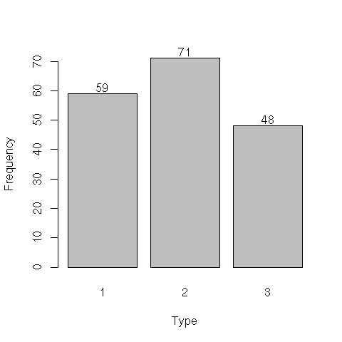
load("wine.Rdata")
attach(wine)
par(xpd=TRUE)
bp <- barplot(summary(Type), xlab="Type", ylab="Frequency")
text(bp, summary(Type)+2, summary(Type))
|
The following examples based on Marc Schwartz examples posted to R help in 2002.
A simple barplot using cex.axis to make the font a bit smaller, drawing the x and y axes separately, to avoid making both fonts:
> mp <- barplot(1:16, axes = FALSE, axisnames = FALSE) > axis(2) > axis(1, at = mp, labels = 1:16, cex.axis = 0.5) |

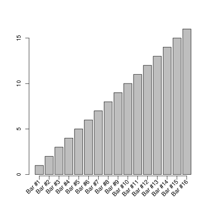
To obtain 45 degree x axis labels one approach is:
> labels <- paste("Bar #", 1:16, sep ="")
> mp <- barplot(1:16, axes = FALSE, axisnames = FALSE)
> text(mp, par("usr")[3], labels = labels, srt = 45, adj = 1, xpd = TRUE)
> axis(2)
|

To also draw the actual x axis line and tick marks, we need to shift the rotated x axis labels downward:
> labels <- paste("Bar #", 1:16, sep="")
> mp <- barplot(1:16, axes=FALSE, axisnames=FALSE)
> text(mp, par("usr")[3] - 0.5, labels=labels, srt=45, adj=1, xpd=TRUE)
> axis(1, at=mp, labels=FALSE)
> axis(2)
|
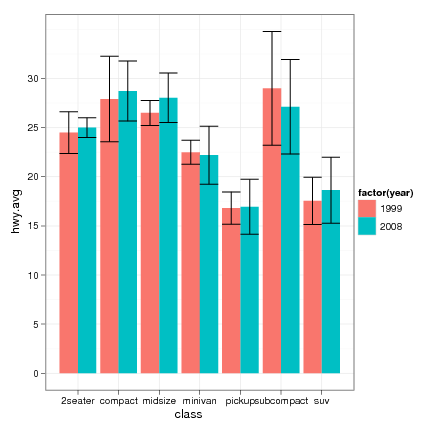
An example using ggplot2
> library(ggplot2)
> data(mpg)
> hwy.avg <- ddply(mpg, c("class", "year"),
                   function(df) return(c(hwy.avg=mean(df$hwy), hwy.sd=sd(df$hwy))))
> avg.plot <- qplot(class, hwy.avg, fill=factor(year), data=hwy.avg, geom="bar",
                    position="dodge")
> pl <- avg.plot +
    geom_errorbar(aes(ymax=hwy.avg+hwy.sd, ymin=hwy.avg-hwy.sd), position="dodge") +
    theme_bw()
> print(pl)
|