
Desktop Survival Guide
by Graham Williams
|
|
DATA MINING
Desktop Survival Guide by Graham Williams |
|
|||
Density Plot |


|
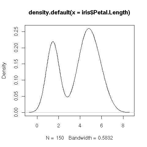
plot(density(iris$Petal.Length)) |
Here's an example that illustrates uniformity. The histogram shows a lot of variance in the uniform random sample, at least for small samples, whereas the quantile plots are more effective in showing the uniformity (or density).
> hist(runif(100))
> hist(runif(1000))
> hist(runif(10000))
> hist(runif(100000))
> hist(runif(1000000))
> hist(runif(10000000))
> hist(runif(100000000))

> par(mfrow=c(2,2))
> for(i in c(10, 100, 1000, 10000)) {
   qqplot(runif(i), qunif(seq(1/i, 1, length=i)), main=i,
          xlim=c(0,1), ylim=c(0,1),
          xlab="runif", ylab="Uniform distribution quantiles")
   abline(0,1,col="lightgray")
 }
|
Histograms are not particularly good as density estimators. However, most of the time histograms are used as an exploratory tool useful in assisting in understanding our data. Using small bin widths helps find unexpected gaps and patterns in our data, and gives an initial view of the distribution.