
Desktop Survival Guide
by Graham Williams
|
|
DATA MINING
Desktop Survival Guide by Graham Williams |
|
|||
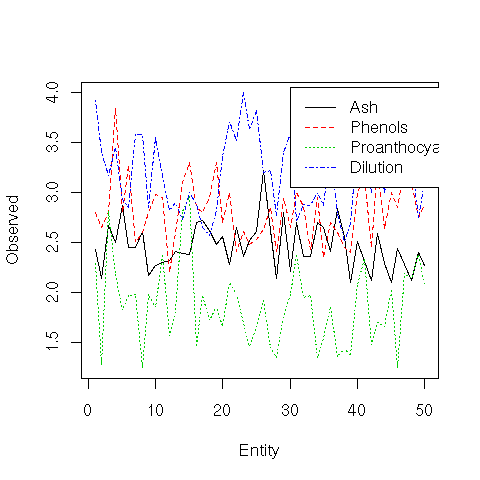
Multiple Line Plots |


|
A line plot displays a line corresponding to one or more variables over some series of data or entities. The matplot function will display multiple lines from data in a matrix. such a plot is useful in observing changes in variables over time or across entities.
In our example we plot just the first 50 entities in the
wine dataset, and choose four variables to plot. These
kinds of plots can get very crowded if we attempt to plot too much
data. A legend is placed in an appropriate location (at the point
![]() ) using the legend function, where we also
identify the colours, using Roption[]col, to be the first four in
the colour pallete, and the line types, using Roption[]lty, as the
firsts four line types.
) using the legend function, where we also
identify the colours, using Roption[]col, to be the first four in
the colour pallete, and the line types, using Roption[]lty, as the
firsts four line types.
load("wine.Rdata")
cols <- c("Ash", "Phenols", "Proanthocyanins", "Dilution")
matplot(1:50, wine[1:50,cols], type="l", ylab="Observed", xlab="Entity")
legend(30, 4.05, cols, col=1:4, lty=1:4)
|